Let’s go on a little tour of the blog shall we? We’ll start at the top and work our way to the bottom. There are a lot of things I am excited about but still working on. Hopefully you’ll bear with me as I figure it all out. Going from blogger to WordPress has been a learning experience for me but I already love the control I have over how it looks. Before I go any further I have to give a BIG THANK YOU to Misty for helping me with design and coding when I get stuck. She is awesome!
Years ago when I started my etsy shop I used Cranial Hiccups as the name because that’s how I thought of any idea that came into my head – it was a hiccup, something my brain accidentally spilled out. Over time I found that many assumed my old blog, Chocolate on my Cranium, was a recipe or food blog. While I do share our family’s favorite recipes there is so much more I share on here! I don’t want to limit myself. I have too many interests and so many different aspects of my life to do that.
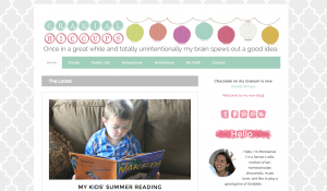
When I think of hiccups I think of bubbles or something airy and light. I went looking for graphics that fit those descriptions and found the wonderful paper lanterns in my header at Angie Makes. She has so many delightful images! Her hot air balloons were a close second. Who knows, I might just create custom headers for each season or month!
The template I am using for Cranial Hiccups allows me to feature any post I want at the top. For now I have it set to feature the latest post with others below that. I wanted visitors to be able to see a variety of posts without having to scroll through the whole post to get to the next one.
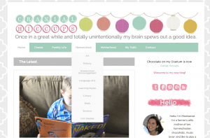
Just under the header is a navigation menu. It took me all of a morning to get that baby set up. There are still a few tweaks here and there to make but for now I have it as I want it. There is so much information shared over the last 8 years that hopefully this will make it a bit easier to find posts on whatever you are looking for. Take some time to scroll over each category to see the topics in each. I welcome any suggestions you may have! Eventually we (meaning Misty) will make that menu “stick” to the top of the page so even if you have scrolled all the way down you will still have access to the menu.
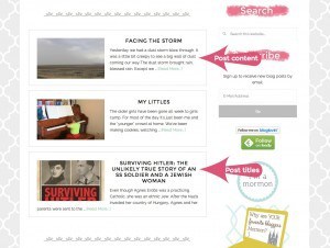
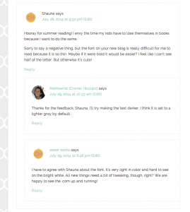
On the home page below the featured post are the previous three posts with a preview snippet of each. The font of the post content is called Raleway. I’ve already received feedback that it was too light and hard to read. I have adjusted it to be a darker gray color and also chose to give it more ‘weight’ – not quite bold but weightier than normal. Hopefully that has resolved the problem, but if not please let me know. The blog needs to be readable, right?
One of the little things I am excited about is the font for the post titles. Why? Because it is called Montserrat! The capital G and J are the most unique letters. The Montserrat font was created by Julieta Ulanovsky who grew up in the traditional neighborhood of Buenos Aires called Montserrat. She wanted to preserve the typography of the old posters and signs from the neighborhood from the first half of the twentieth century. Pretty cool to have my own font!
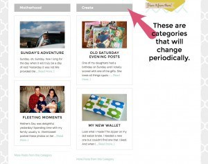
The bottom of the blog’s homepage has a spot for posts from different categories to be featured. These will change periodically depending on my mood. It will also give a chance for old posts to be spotlighted again!
I am very excited that people can reply to individual comments on posts so there can be a conversation happening within a conversation. It just makes it more personal. I can also reply directly to individuals’ questions.
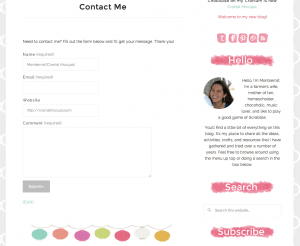
And last for now is my contact page. You can access it from the menu. It’s an easy way for anyone to send me questions or concerns or contact me about other things (reviews, giveaways, etc.)
So what do you think? Any suggestions? Feedback? Please feel free to leave them in the comments!
Looks awesome! The font is now perfect!!
The new site is nice. In terms of technical feedback viewing on a tablet your blog header is cut off on both sides.
Thanks, Jeanette, I’ll take a look at it.
Your new blog is beautiful and works great here. I miss the chocolate a little, but I understand the need to change things now and then.
I love it! I loved Chocolate on my Cranium too, but I like the set up! I love the top drop down menus! But for some reason, I was not transferred over to the new blog with my email subscription… I just signed up, though! Yay! Very excited for you!
Ack! I totally forgot about transferring the email subscriptions from Chocolate on my Cranium. Thanks for letting me know. I’ll take a look to see what I can do. I wonder what else I have forgotten?
Hi! I like the new look and have enjoyed reading your blog from the very beginning. However, I can’t find a way to read through your posts consecutively as you posted them. Is here a way to do that, or is it a feature you plan to add? I like reading a blog like a book and then keeping up on it. From there, I remember who has what and know that I can search for what I need when it is needed. My children are grown so my favorite part of your blog is the spirituality that you seem to lend to everything you do – it has fed me. Corny, I know, but relevant in my life nevertheless. Thanks for all you do! I am learning so much from you to use as my foray into grandmothing begins! 🙂
Hi Sharon, it is something we are working on – creating links at the bottom of a post to newer or older posts.
Thanks for the feedback, not only on the setup of the blog but on what you enjoy reading. It is much appreciated!
I LOVE it!!! (Sorry to be so late to the party!) I’m thinking about how to consolidate my two blogs and then transfer everything to WordPress. I really appreciate you sharing your switch-over process a bit here! 🙂